NFT Dashboard Application Development.
Through a wide variety of mobile applications, we’ve developed a unique visual system.
We create responsive, user-friendly websites using the latest tools and best practices. Our aim is to ensure seamless functionality and optimal performance across all devices, establishing your strong online presence.

Boost your business online with our award-winning websites. Build a strong web presence and achieve success today!
Website maintenance is truly an art. Allow us the opportunity to address any potential issues and bugs before they arise.
Shine your business with artificial intelligence. Allow us to create a customized chatbot designed specifically for your needs. For Example - Text To Image Generator
Our experts can develop custom plugins tailored specifically to meet your needs. For Example Custom Gallery on any Web Page.
Automate your work in your browser effortlessly with our powerful, customized extensions—save time and reduce effort on any task.
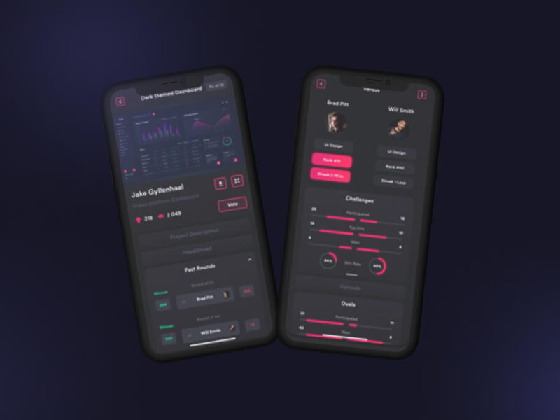
Through a wide variety of mobile applications, we’ve developed a unique visual system.
There are always some stocks, which illusively scale lofty heights in a given time period. However, the good show doesn’t last for these overblown toxic stocks as their current price is not justified by their fundamental strength.
A strategy is a general plan to achieve one or more long-term. labore et dolore magna aliqua.
UI/UX Design, Art Direction, A design is a plan or specification for art. which illusively scale lofty heights.
User experience (UX) design is the process design teams use to create products that provide.
Toxic companies are usually characterized by huge debt loads and are vulnerable to external shocks. Accurately identifying such bloated stocks and getting rid of them at the right time can protect your portfolio.
Overpricing of these toxic stocks can be attributed to either an irrational enthusiasm surrounding them or some serious fundamental drawbacks. If you own such bubble stocks for an inordinate period of time, you are bound to see a massive erosion of wealth.
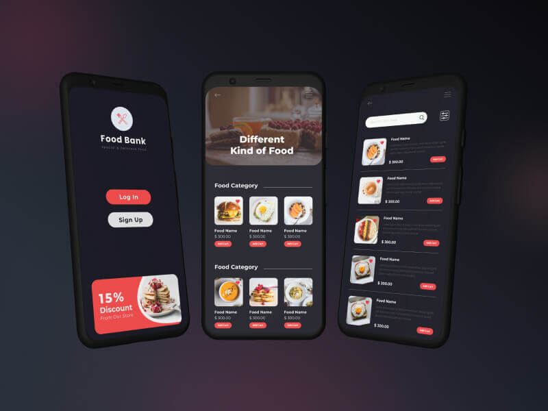
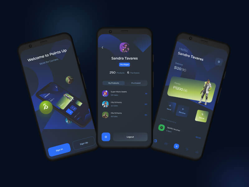
However, if you can precisely spot such toxic stocks, you may gain by resorting to an investing strategy called short selling. This strategy allows one to sell a stock first and then buy it when the price falls.
While short selling excels in bear markets, it typically loses money in bull markets.
So, just like identifying stocks with growth potential, pinpointing toxic stocks and offloading them at the right time is crucial to guard one’s portfolio from big losses or make profits by short selling them. Heska Corporation HSKA, Tandem Diabetes Care, Inc. TNDM, Credit Suisse Group CS,Zalando SE ZLNDY and Las Vegas Sands LVS are a few such toxic stocks.Screening Criteria
Here is a winning strategy that will help you to identify overhyped toxic stocks:
Most recent Debt/Equity Ratio greater than the median industry average: High debt/equity ratio implies high leverage. High leverage indicates a huge level of repayment that the company has to make in connection with the debt amount.
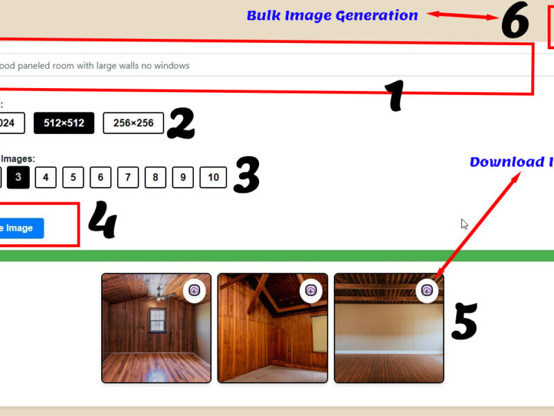
How to Use a Bulk Image Generator Tool for Stunning Visual Content
If you’re looking to generate high-quality images quickly, a bulk image generator tool can be a game-changer. In this blog, we’ll walk you through a sample interface of a bulk image generation tool, explaining each feature and how it helps streamline the image creation process. This step-by-step guide will cover everything from entering prompts to downloading your final images. Let’s dive in!
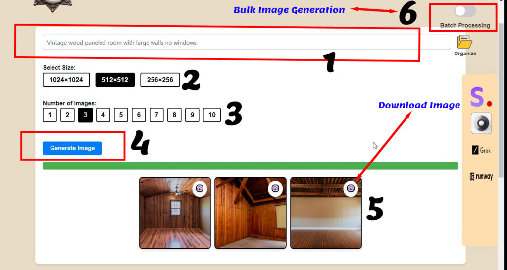
At the top of the tool, there’s a text box (marked as 1) where you can enter a descriptive prompt for the type of image you want to generate. For example, if you’re looking to create images of a “vintage wood-paneled room with large walls and no windows,” simply type that phrase in. The better your prompt, the more likely you are to get the images you envision. Be specific about colors, materials, or any particular mood you’re trying to capture.
Below the prompt box, you’ll find the Select Size options (marked as 2). This feature lets you choose the dimensions for your images. Common options are 1024×1024, 512×512, and 256×256 pixels. Selecting the right size depends on where you plan to use your images. For example, 1024×1024 pixels would be ideal for social media posts, while a smaller size might work better for thumbnails or icons.
This tool allows you to choose the Number of Images to generate at once (marked as 3). Simply click on a number from 1 to 10 to specify how many images you need. Bulk generation is particularly useful when you’re testing different variations or when you need multiple images with similar themes.
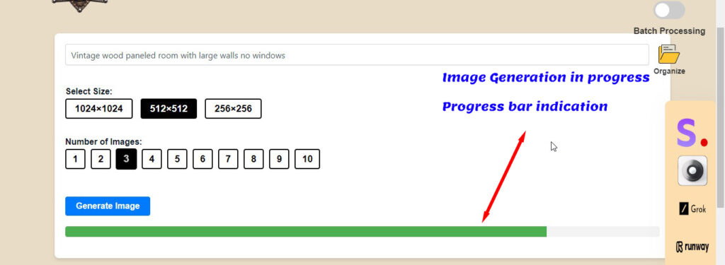
Once your prompt, size, and number of images are set, hit the Generate Image button (marked as 4). This is where the magic happens. The tool processes your request and begins generating images based on the input parameters. In just a few moments, you’ll have a set of images ready for review.
After the images are generated, they’ll appear in a grid below the generation settings (marked as 5). Each image has a download icon, allowing you to save it directly to your device. This easy access makes it convenient to review and download your images without any hassle.
If you’re working on multiple projects or need to generate images for various prompts, use the Batch Processing toggle (marked as 6) to switch to batch mode. This feature allows you to handle multiple prompts or tasks simultaneously, saving you time and effort when working on large-scale projects.
The sidebar on the right side of the tool includes several other options, such as “Organize” to help you manage your image files and logos for additional integrations or tools that may enhance your image editing capabilities. Explore these options to see how they can support your workflow and make your image generation even smoother.
This bulk image generator tool is perfect for designers, marketers, and content creators who need high-quality visuals quickly. By following these simple steps and exploring all the features, you can make the most of this tool to create stunning images for your projects. Whether you’re working on social media content, website images, or just exploring creative ideas, this tool is designed to simplify and accelerate the image generation process.
Specialized in software development and data analysis Graduated with honors and completed a capstone project in machine learning
Focused on development services and mastering programming languages Completed coursework in software engineering and IT fundamentals
Dynamic Web Developer & Trainer with extensive experience in creating responsive web solutions.
Developed and maintained responsive UI components using HTML, CSS, and JavaScript. Collaborated with cross-functional teams to deliver seamless web applications, enhancing user engagement by 30%.
Dynamic Web Developer & Trainer with extensive experience in creating responsive web solutions.
Development services and mastering programming languages
Training of AI modal on custom data to get more concise solutions for your business
Awarded websites for your business
The education should be very interactual. Ut tincidunt est ac dolor aliquam sodales. Phasellus sed mauris hendrerit, laoreet sem in, lobortis mauris hendrerit ante.
The education should be very interactual. Ut tincidunt est ac dolor aliquam sodales. Phasellus sed mauris hendrerit, laoreet sem in, lobortis mauris hendrerit ante.
The education should be very interactual. Ut tincidunt est ac dolor aliquam sodales. Phasellus sed mauris hendrerit, laoreet sem in, lobortis mauris hendrerit ante.
The education should be very interactual. Ut tincidunt est ac dolor aliquam sodales. Phasellus sed mauris hendrerit, laoreet sem in, lobortis mauris hendrerit ante.
The education should be very interactual. Ut tincidunt est ac dolor aliquam sodales. Phasellus sed mauris hendrerit, laoreet sem in, lobortis mauris hendrerit ante.
The education should be very interactual. Ut tincidunt est ac dolor aliquam sodales. Phasellus sed mauris hendrerit, laoreet sem in, lobortis mauris hendrerit ante.

I am absolutely certain that I will collaborate with ASIM again in the future. The efficiency and professionalism displayed were remarkable. Their communication was consistently clear and prompt, ensuring that every aspect of the project was seamlessly managed. Additionally, their pricing was fair and transparent, reflecting the high quality of their work. I wholeheartedly recommend ASIM to anyone seeking top-notch service and a reliable partner.

Exelente, rápido y tal como se esperaba...!!!!

Great to work with. Fast delivery. Friendly and helpful. Proactive communications. Quick responsiveness. Would definitely recommend services. Above and Beyond!

Asim did an amazing job on my website! He understood my needs perfectly and delivered a professional, modern design. Highly recommended for anyone looking for a skilled and reliable web developer! I appreciate his attention to details.
All the Lorem Ipsum generators on the Internet tend to repeat predefined chunks as necessary
1 Page with Elementor
Design Customization
Responsive Design
Content Upload
Design Customization
2 Plugins/Extensions
Multipage Elementor
Design Figma
MAintaine Design
Content Upload
Design With XD
8 Plugins/Extensions
All the Lorem Ipsum generators on the Internet tend to repeat predefined chunks as necessary
5 Page with Elementor
Design Customization
Responsive Design
Content Upload
Design Customization
5 Plugins/Extensions
Multipage Elementor
Design Figma
MAintaine Design
Content Upload
Design With XD
50 Plugins/Extensions
All the Lorem Ipsum generators on the Internet tend to repeat predefined chunks as necessary
10 Page with Elementor
Design Customization
Responsive Design
Content Upload
Design Customization
20 Plugins/Extensions
Multipage Elementor
Design Figma
MAintaine Design
Content Upload
Design With XD
100 Plugins/Extensions
Building Your First Python Calculator: A Step-by-Step Guide With Taturiol

Today, we’ll create a simple calculator program that will not only perform basic arithmetic operations like adding, subtracting, multiplication, and division but also serve as an excellent exercise in understanding key programming concepts for python only. Whether you’re new to Python or brushing up on your skills, this project is perfect for you. Let’s dive in! In this blog i have shared complete source code so you can learn from it.
Calculators are a staple of programming tutorials because they encapsulate fundamental concepts like arithmetic operations, user input, and control flow—making them a perfect learning project for beginners. By the end of this tutorial, you’ll have a fully functional calculator and a better grasp of Python basics. Let me share code!
# Simple Python Calculator Program

def add(x, y):
    """This function adds two numbers"""
    return x + y

def subtract(x, y):
    """This function subtracts two numbers"""
    return x - y

def multiply(x, y):
    """This function multiplies two numbers"""
    return x * y

def divide(x, y):
    """This function divides two numbers"""
    if y == 0:
        return "Error! Division by zero."
    else:
        return x / y

def calculator():
    """Main function to run the calculator"""
    print("Welcome to the Simple Calculator!")
    print("Select operation:")
    print("1. Add")
    print("2. Subtract")
    print("3. Multiply")
    print("4. Divide")

    while True:
        # Take input from the user
        choice = input("Enter choice(1/2/3/4): ")

        # Check if choice is one of the four options
        if choice in ['1', '2', '3', '4']:
            try:
                num1 = float(input("Enter first number: "))
                num2 = float(input("Enter second number: "))
            except ValueError:
                print("Invalid input! Please enter a number.")
                continue

            if choice == '1':
                print(f"The result is: {add(num1, num2)}")

            elif choice == '2':
                print(f"The result is: {subtract(num1, num2)}")

            elif choice == '3':
                print(f"The result is: {multiply(num1, num2)}")

            elif choice == '4':
                print(f"The result is: {divide(num1, num2)}")

        else:
            print("Invalid input! Please select a valid operation.")

        # Ask if the user wants another calculation
        next_calculation = input("Do you want to perform another calculation? (yes/no): ")
        if next_calculation.lower() != 'yes':
            break

# Run the calculator
calculator()def add(x, y): return x + ydef subtract(x, y): return x - y def multiply(x, y): return x * y def divide(x, y): if y == 0: return "Error! Division by zero." return x / y divide function includes a check to prevent division by zero, which is an example of error handling.def calculator(): print("Welcome to the Simple Calculator!") print("Select operation:") print("1. Add") print("2. Subtract") print("3. Multiply") print("4. Divide") while loop to repeatedly ask the user for input until they decide to exit. This loop ensures the program can handle multiple calculations without restarting.while True: choice = input("Enter choice(1/2/3/4): ") if choice in ['1', '2', '3', '4']: try: num1 = float(input("Enter first number: ")) num2 = float(input("Enter second number: ")) except ValueError: print("Invalid input! Please enter a number.") continue Here, we gather the user’s choice and validate it. If the user inputs an invalid number, we catch the exception and prompt them again.if choice == '1': print(f"The result is: {add(num1, num2)}") elif choice == '2': print(f"The result is: {subtract(num1, num2)}") elif choice == '3': print(f"The result is: {multiply(num1, num2)}") elif choice == '4': print(f"The result is: {divide(num1, num2)}") We use if and elif statements to control which operation is performed based on user input.next_calculation = input("Do you want to perform another calculation? (yes/no): ") if next_calculation.lower() != 'yes': break This logic allows the user to exit the loop and end the program gracefully.calculator function to start the program.calculator()Creating a calculator in Python is a fantastic way to practice essential programming skills. Infact i would like to say you must learn any programming language with fun and with creating essential basic projects that’s how i learn. As you become more comfortable, try modifying the code to see how changes affect the program. Remember, the best way to learn is through experimentation and practice. Keep coding, stay curious, and enjoy the journey of learning Python!
Happy learning and coding python!
Creating a website is not difficult, even for beginner web

Creating a website is not difficult, even for beginner web developers, but making that website responsive for every device is truly an art.
Around 70% of the world’s population access the internet via mobile phones. People use mobile devices for entertainment, e-commerce, financial management, business meetings, and more. According to a Google Report, as of Q1 2024, 95.9% of global internet users accessed the internet via mobile phones, while 62.2% used laptops or desktops. Mobile devices accounted for 58.33% of global website traffic in Q1 2023, up from 31.16% in Q1 2015.
Making a website unresponsive can result in a loss of traffic and ultimately a loss of business. Therefore, ensuring a website is responsive across all screen sizes is crucial.
This is a common question. Below, I will explain the best practices for creating responsive websites that are not only visually appealing but also functional and efficient.
A cornerstone of responsive design is the use of flexible grid layouts. Instead of fixed-width layouts, grids that adapt to the screen size ensure that content is presented beautifully on any device. This approach allows elements to resize and reposition themselves dynamically, maintaining the design’s integrity and responsive accross all screen sizes.
Images should scale within the confines of their containers. This means using CSS techniques to ensure images resize proportionately, avoiding distortion or cutoff. The max-width: 100% rule is a simple yet effective way to ensure images remain responsive.
Media queries in CSS allow designers to apply styles based on the conditions of the viewing environment, such as screen size or resolution. This enables the customization of layouts for different devices, enhancing the user experience by adjusting typography, layout, and navigation elements accordingly.
Example Implementation
Here are two simple examples that demonstrate responsive design using media queries. These examples illustrate how a basic HTML form and a navigation bar can be adapted for different screen sizes using media queries. This approach highlights how media queries can effectively adjust layouts for different devices, enhancing user experience across various screen sizes.
<!DOCTYPE html>
<html lang="en">
<head>
    <meta charset="UTF-8">
    <meta name="viewport" content="width=device-width, initial-scale=1.0">
    <title>Responsive Form with Media Queries</title>
    <style>
        /* Basic styling for the form */
        body {
            font-family: Arial, sans-serif;
            margin: 0;
            padding: 20px;
            background-color: #f4f4f4;
        }

        form {
            background: #fff;
            padding: 20px;
            border-radius: 5px;
            max-width: 600px;
            margin: auto;
            box-shadow: 0 0 10px rgba(0,0,0,0.1);
        }

        label {
            display: block;
            margin-bottom: 5px;
        }

        input[type="text"], input[type="email"] {
            width: 100%;
            padding: 10px;
            margin-bottom: 10px;
            border: 1px solid #ddd;
            border-radius: 4px;
        }

        /* Media query for screens larger than 600px */
        @media (min-width: 601px) {
            form {
                display: flex;
                flex-direction: row; /* Display form fields inline */
                align-items: center;
                justify-content: space-between;
            }

            label, input[type="text"], input[type="email"] {
                flex: 1;
                margin-right: 10px;
                font-size: 14px; /* Smaller font size for larger screens */
            }

            input[type="text"]:last-child {
                margin-right: 0;
            }
        }

        /* Media query for mobile devices (less than 600px) */
        @media (max-width: 600px) {
            form {
                flex-direction: column; /* Stack form fields vertically */
            }

            label, input[type="text"], input[type="email"] {
                font-size: 18px; /* Larger font size for better readability */
            }
        }
    </style>
</head>
<body>

    <form>
        <div>
            <label for="name">Name:</label>
            <input type="text" id="name" name="name">
        </div>
        <div>
            <label for="email">Email:</label>
            <input type="email" id="email" name="email">
        </div>
    </form>

</body>
</html>
<!DOCTYPE html>
<html lang="en">
<head>
    <meta charset="UTF-8">
    <meta name="viewport" content="width=device-width, initial-scale=1.0">
    <title>Responsive Navigation Bar</title>
    <style>
        body {
            font-family: Arial, sans-serif;
            margin: 0;
            padding: 0;
            background-color: #f4f4f4;
        }

        .navbar {
            background-color: #333;
            overflow: hidden;
        }

        .navbar a {
            float: left;
            display: block;
            color: #f2f2f2;
            text-align: center;
            padding: 14px 16px;
            text-decoration: none;
        }

        .navbar a:hover {
            background-color: #ddd;
            color: black;
        }

        /* Hide the links inside the navigation menu (except for the hamburger menu) on small screens */
        .navbar .nav-links {
            display: none;
        }

        .navbar .icon {
            display: block;
            float: right;
        }

        /* Media query for screens larger than 600px */
        @media (min-width: 601px) {
            .navbar a {
                float: left;
            }

            .navbar .nav-links {
                display: flex;
                justify-content: flex-end;
            }

            .navbar .icon {
                display: none; /* Hide hamburger menu on large screens */
            }
        }

        /* Media query for mobile devices (less than 600px) */
        @media (max-width: 600px) {
            .navbar a:not(:first-child) {
                display: none; /* Hide all links except the first link (Home) */
            }

            .navbar a.icon {
                float: right;
                display: block;
            }
        }
    </style>
</head>
<body>

    <div class="navbar">
        <a href="#home">Home</a>
        <div class="nav-links">
            <a href="#about">About</a>
            <a href="#services">Services</a>
            <a href="#contact">Contact</a>
        </div>
        <a href="javascript:void(0);" class="icon" onclick="toggleMenu()">
            ☰
        </a>
    </div>

    <script>
        function toggleMenu() {
            var x = document.querySelector(".nav-links");
            if (x.style.display === "block") {
                x.style.display = "none";
            } else {
                x.style.display = "block";
            }
        }
    </script>

</body>
</html>Some leading brands have adopted responsive design with great success:
Responsive design must be consistent across various web browsers. Regular testing during development can identify and resolve compatibility issues. Tools like BrowserStack or LambdaTest are invaluable for ensuring that your website functions correctly across all major browsers.
Frameworks such as Bootstrap and Foundation offer a solid foundation for responsive design. These frameworks provide pre-designed grid systems, components, and utilities that can accelerate development while ensuring a high level of responsiveness. They also foster consistency and maintainability across your projects.
There are numerous benefits to having a responsive website. Below are some key points:
As technology continues to evolve, staying informed and adaptable to new methodologies will ensure your web presence remains effective and relevant. If you need a responsive website for your business or want to make an existing website responsive, we are here to help.

Let's Connect & Create Awarding websites with AI Integration.
Phone: +92 303 2171000 Email: contact@asimservices.comWelcome